Wednesday, December 10, 2014
Final Project
This project was very fun, it was a compilation of all the work i've done over the semester. This was done on the indesign software.
Wednesday, November 19, 2014
Animation
This Project i created for my friend who is a photographer. I made a slideshow of all his photos he’s taken, and then added his info at the end. This was all made on Adobe Photoshop.
Monday, November 3, 2014
Photoshop project
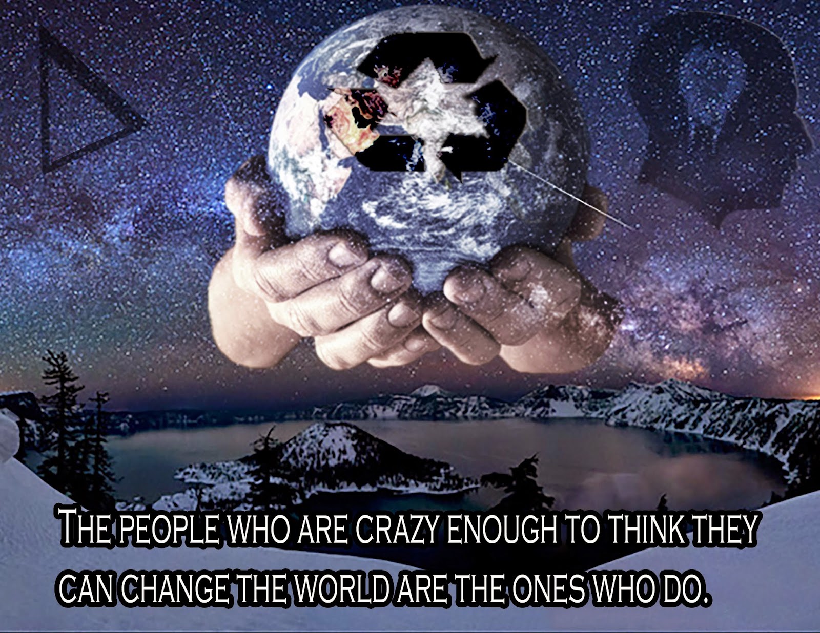
I created this Project in Adobe Photoshop. I used the background of a shot of space with mountains in front of it. Then I brought in the Delta sign, because it means change in math. Then used someone thinking, and a lightbulb going off in their head. Then I put hands with the world in them. This is to show you have the world in your hands. Then i used one of my favorite quotes “ The People Who Are Crazy Enough To Think They Can Change The World Are The Ones Who Do.”.
Monday, October 27, 2014
Photoshop Graphic Design
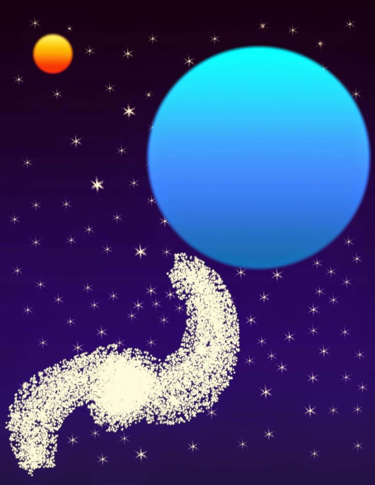
To create this Project I used Adobe Photoshop. I used different types of brushes, and shapes. I tried to remake outer space. I wanted to make space, because it is interests me so much.
Sunday, October 26, 2014
Magazine Cover
I made a Magazine Cover for a Fictional brand called Up-State. I used photos from me fishing and pictures from mountains I hiked over the years. I chose to make a outdoors magazine, because hiking and fishing is a big part of my life. I made this project in Adobe Photoshop.
Wednesday, October 15, 2014
Tuesday, October 14, 2014
vector illustration
Volkswagen GTI
In the Design on the other page, I recreated a MK3 Volkswagen GTI. This project was created in Adobe Illustrator. I chose to do this, because I used to own an MK5 GTI. That model was to difficult to create ,so I decided to create the old more box looking model.
Sunday, October 5, 2014
Sunday, September 28, 2014
Project 2
The company this logo is for is called Vibes radio. I used the blue in the V to give it that calm, relaxing feeling to it. I made headphones around the V to symbolize, that the company has to do with music. I also put the gradient circle on the bottom just to make the image pop more, and give it more of a complete look.
Wednesday, September 24, 2014
Caligramme
For this Project we used the program Adobe Photoshop. We had to draw something, and then put lyrics or words around the drawing. I mad a smiley face, and then put the lyrics from the song Don’t Worry Be Happy.
Tuesday, September 16, 2014
Logo Critique
These
golden arches are one of the most famous logos around the world. The golden
arches were introduced in 1962, as the chains logo. The target audience that McDonald’s is
looking for is anyone who is on the go, and has to stop for a quick bite. This is one of the most successful logos out
there I believe, if you go anywhere in the world and see the golden arches you
know its McDonalds. It is a universal logo, and is known by all ages, and all
groups. The color red plays a big part in their logo, because red is supposed
to make you feel hungry.
Red
Bull discovered in 1987, is known as one of the biggest energy drinks around
the world. They sponsor all sports, but especially extreme sports. There target audience is teens and young
adults, it is for people who are on the go or are involved in some action
sports and want that extra bit of energy. The logo speaks for itself
considering the name is red bull, and the logo consists of two red bulls. The
color used though is good; the color red gives it that excitement, adventurous,
action feeling that the company portrays through its events.
Burton
is a snowboarding company that has been around for years. It is one of the most
recognizable snowboarding companies. They sponsor many events like the winter x
games, Olympics, and other big snowboarding competitions. Jake Burton
established the company in 1977. The logo targets snowboarders across the
globe, at any ages. The logo is successful, because it is a lower case b that
has a turn around that’s symbolizes for going back up. The logo is also
scalable for any size, so you can place it on any type of equipment.
Volkswagen
is company that began in Germany in the 1930’s. They designed a car that was
affordable for all people. The Volkswagen is very simple, but is a big part of
the company. The logo is a v over a w, surrounded by a circle. I think their target market is the middle
class, considering the make affordable cars. The color blue in this logo gives
it that loyal, secure feeling that you would want with a vehicle.
Google
has come a long way, discovered by Larry Page in 1996 at Stanford University. It
is one of the most popular search engines around. The logo is recognized by
millions of people all across the globe, it targets all ages and all types of
people. The colors give it that friendly, welcoming feeling. I think this logo
is very successful even though it is very simple; it has been very successful
for the face of Google.
Subscribe to:
Comments (Atom)


